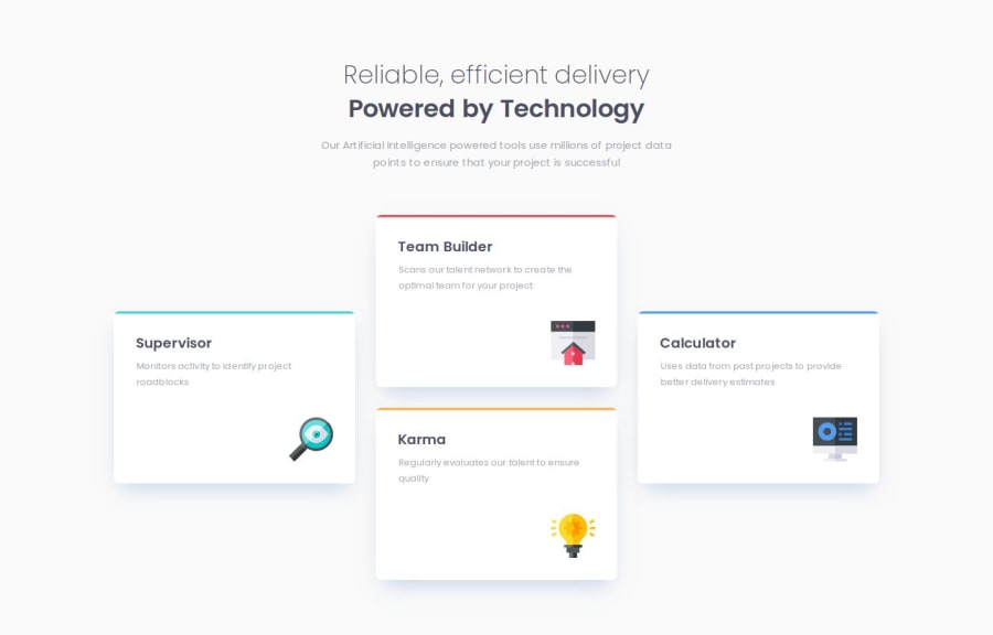
Four Card Feature Section | Next.js, Typescript, Tailwind CSS
Design comparison
Solution retrospective
Some elements with Tailwind can get quite messy, like custom linear gradient images. If I were to do it again, I might consider going back to something more traditional, like combining CSS modules with Tailwind, trying to get the best of both worlds.
Community feedback
- @fr4nbttPosted 6 months ago
I can't provide detailed feedback since the solution uses TypeScript and a few other technologies that I'm not familiar with. However, I can say that the solution very closely resembles the original design, looks good across a range of screen sizes, and the code is well-structured, readable, and reusable.
Congratulations on that, and keep up the great work!
0
Please log in to post a comment
Log in with GitHubJoin our Discord community
Join thousands of Frontend Mentor community members taking the challenges, sharing resources, helping each other, and chatting about all things front-end!
Join our Discord
