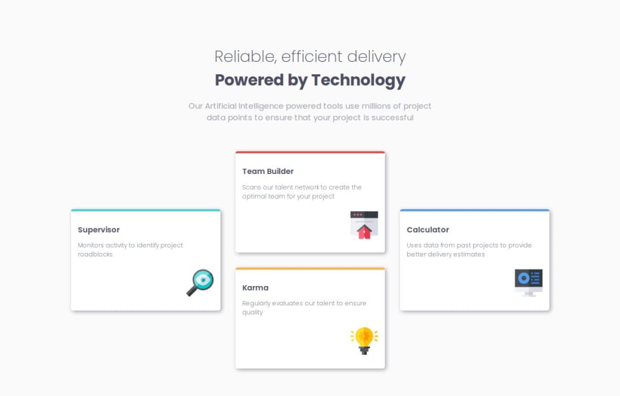
Design comparison
Solution retrospective
not much.
What specific areas of your project would you like help with?- responsiveness of site & fluidness of typography and anything in between related to them.
- As always if you see something i may be doing wrong or if there is a better way to achieve something please let me know!
Community feedback
- @grace-snowPosted 5 months ago
So this looks great, but there's one problem that stood out straight away to me in this – This design does not include a header. It's important to understand what page-level landmarks are each for. The
headeris a banner role, which means it is meant to hold primary content that repeats over multiple pages or a whole site. There should be no page-specific content in a header, definitely not a h1.You don't need the br element inside the main heading. Note some screen readers will announce br as "break" which isn't needed here. Instead, just set one of the halves of the heading to display block.
The icons in this are decorative so must have empty alt. It's great that you're trying to write good alt text on images, but in this case the descriptions are definitely unnecessary and far too verbose.
⚠️ This is important - The cards must not have a height or max-height. That is going to cause overflow problems for some users. There's no reason for these cards to have a max width or height actually. Let the grid template define the sizes of the children. That's an important principle when working with grid. Let the grid have control.
This really only needs to be grid by default, then have the max-width and columns of that grid changed for larger screens. You're making the css longer unnecessarily by using flex on mobile and adding an extra media query.
Placing the max width on the grid itself is more usual on any site where you will have a max content width.
Marked as helpful3@frost3dWavePosted 5 months ago@grace-snow hello, thank you once again for such a detailed feedback, I have understood everything & will make the changes accordingly. However I didn't quite understand what you mean here,
You're making the css longer unnecessarily by using flex on mobile and adding an extra media query.Although I understood about the extra media query, I am not using flex for layout, it's grid on mobile view too, I am only using flex for the content inside each cards & for centering the page other than that the layout itself is by grid only even on mobile.
Once again, thank you writing such detailed feedback, I really appreciate it.
0
Please log in to post a comment
Log in with GitHubJoin our Discord community
Join thousands of Frontend Mentor community members taking the challenges, sharing resources, helping each other, and chatting about all things front-end!
Join our Discord
