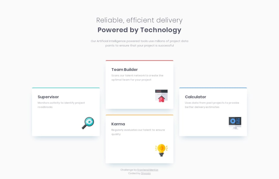
Four card feature section (mobile-first, using vanilla HTML & CSS)
Design comparison
Solution retrospective
I've finished this challenge. If you have any improvement suggestions or interesting alternative ways of doing smth, I would be glad to hear them! Code reviews or any other feedback are appreciated.
Community feedback
- @edburtnieks-privatePosted over 4 years ago
Hey Shoaziz,
Your solution looks really good and clean! Just couple really small points and details I could point out. I like that you made it different for tablet size.
In design, the colored top borders doesn't have that slight curve at the bottom edge when the border meets the edge of card, as you have it in your solution. It's more like a straight line. You could do it with ::before pseudo element instead of top border. But it would a little bit more code, and it looks perfectly good with the current solution. Just a very small detail.
Second, try to see what happens when you extend text content in cards for more than two lines. I know, in design in each card there are exactly 2 lines of text, but let's imagine the content would change in future. Currently the cards won't be the same height on tablet and desktop sizes. Keep in mind that icons could have different spacing above them, not set value (4rem on desktop in your case)
Just something to play around, it shouldn't be difficult to implement.
Otherwise, nice work:)
3@developerbottlePosted over 4 years ago@edburtnieks Thanks for the feedback. I really appreciate it!
Speaking of colored top borders, I did notice that they are not curved in design, but I liked curved ones more :)
And about extending text in cards. Thank you for that! I have totally missed that part :)
0@developerbottlePosted over 4 years ago@edburtnieks I have fixed the issue with cards when there is too much text in them, could you please share your feedback on that again? :)
0@edburtnieks-privatePosted over 4 years ago@SHStorm Nice little solution of restricting the line length instead of making the cards adapt the height as I did in my solution. Looks good :)
1
Please log in to post a comment
Log in with GitHubJoin our Discord community
Join thousands of Frontend Mentor community members taking the challenges, sharing resources, helping each other, and chatting about all things front-end!
Join our Discord