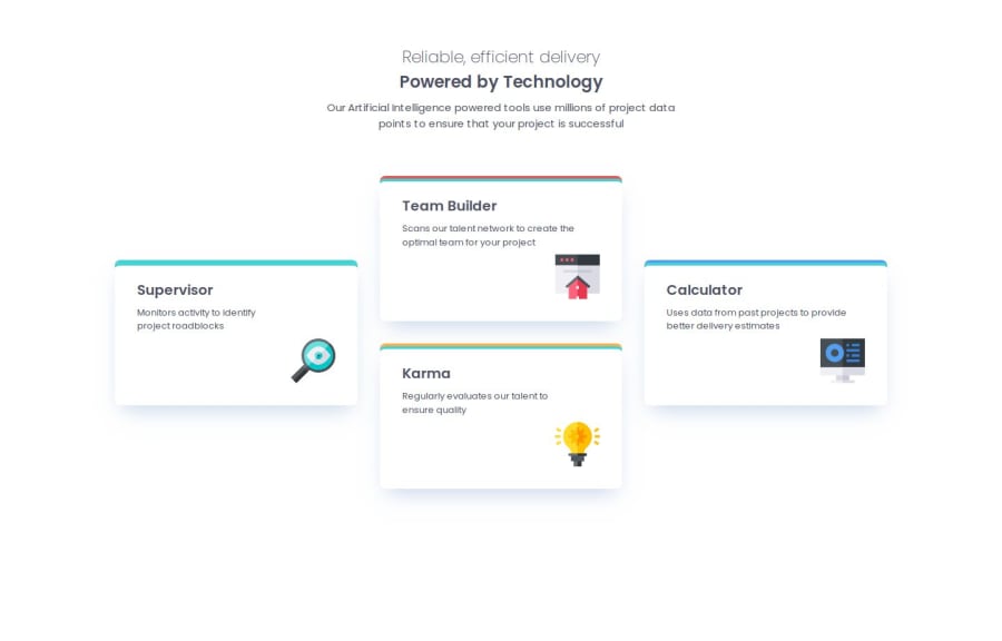
Design comparison
Solution retrospective
During my previous challenge I relied on the video of Kevin Powell completing the challenge. It had been very informative for me. Thanks to the good explanations in this video, I was able to complete this new challenge on my own. I am really happy with this course, I can't wait to move on to the next challenge!
What challenges did you encounter, and how did you overcome them?This time the main difficulty was not the responsive design but the use of the CSS grid function, with grid-template and grid-template-areas in particular. I took my time to understand how it worked because the first time it is not easy to understand and implement. But this function is really too good!
What specific areas of your project would you like help with?Any advice is welcome! I like the advice on good coding practices.
Please log in to post a comment
Log in with GitHubCommunity feedback
- @zeenox-stack
That Looks fantastic, keep up the good work! just a small tip try increasing the font size of the heading and it should work out well enough!!! hope that helps, happy coding.
Join our Discord community
Join thousands of Frontend Mentor community members taking the challenges, sharing resources, helping each other, and chatting about all things front-end!
Join our Discord
