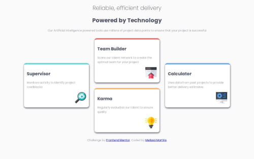
Design comparison
Solution retrospective
- Proud to make the design almost identical
- I would like to be faster at understanding the grid positions
- It was difficult to make the cards on the left and right stay in the middle.
- good programming practices.
Community feedback
- @yefreescodingPosted 4 months ago
Great job with this challenge! I really like the final result; it is practically identical to the original design.
One thing I want to point out is your use of semantic HTML tags. This adds a lot of value if you want to pursue a career in front-end development. Knowing when and how to use different HTML tags like
<header>
,<nav>
,<section>
,<article>
, etc., is very important. Congrats, and keep up the great work!+ Here is some advice for good programming practices:
- Instead of using the id selector in your CSS, you should add a different class to the element, like
<section id="green" class="service-card color-green">
. This is just an example to help you understand what I'm trying to say. You can add as many classes as you need. - Something that can help you a lot with naming your classes is the BEM methodology, which is super useful.
I hope this helps you with your next challenges. I think you're doing amazing so far.
Marked as helpful1@MellTinsPosted 4 months agoThank you for your feedback, I just didn't understand very well about the semantic code: what should I improve? and how long do you think it takes to learn the methodology BEM?@yefreescoding
1@yefreescodingPosted 4 months ago@MellTins
Ok, what I meant by semantic code is basically using tags such as
<header>
,<section>
,<article>
,<footer>
, etc., instead of<div>
. And you did it great! I noticed you used the<section>
tag in your solution...I can't tell exactly how long it would take you to learn BEM, but I can say it won't take much time. It's super easy and is used by many development teams. I'm sure you can find a lot of good resources on Google, ChatGPT, or StackOverflow.
Marked as helpful1 - Instead of using the id selector in your CSS, you should add a different class to the element, like
Please log in to post a comment
Log in with GitHubJoin our Discord community
Join thousands of Frontend Mentor community members taking the challenges, sharing resources, helping each other, and chatting about all things front-end!
Join our Discord