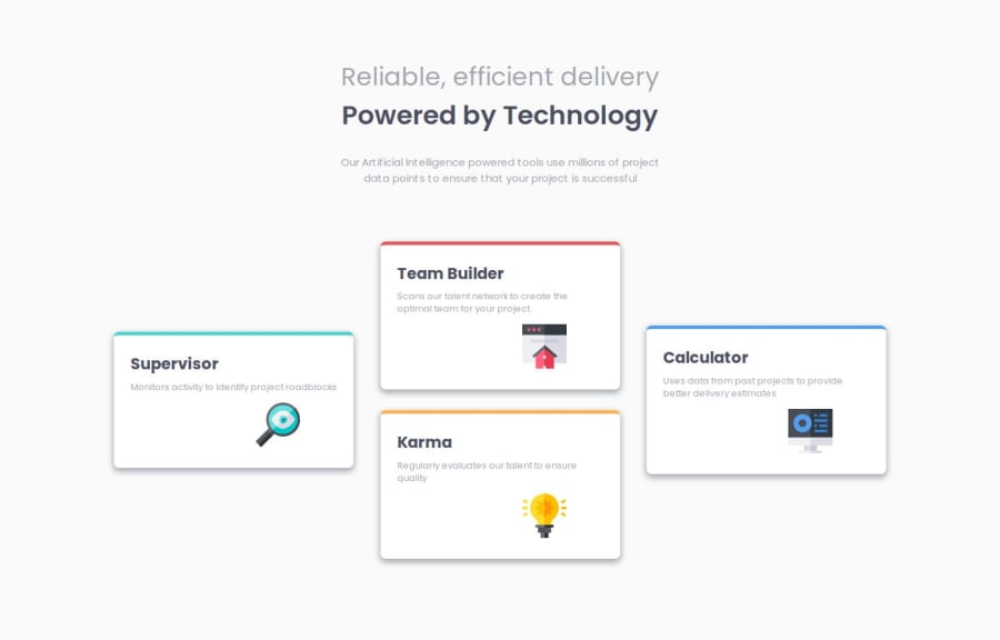
Design comparison
Solution retrospective
I used clamp on p and h1 tag and tryed to do very responsive and that grows and shrink when we change screen size and it works really great here and there got I think same positioning on words how is in design.
What challenges did you encounter, and how did you overcome them?the 3rd and 4th card they dont have same place on small screen and big screen.I found first solution on big screen to change order on card 3rd and 4rd.Then second solution i found to use div on 2 cards in html file and in that case 3rd and 4rd would fit in correct places on bigger screen and that worked great.I decided to leave it like that because I think order in html should be the same as we see it visual.There is for sure case where you need or should use order but in this case I think its not needed
What specific areas of your project would you like help with?Any advice anything I would really be happy to learn more I do research alot on my own about many things in CSS.
Join our Discord community
Join thousands of Frontend Mentor community members taking the challenges, sharing resources, helping each other, and chatting about all things front-end!
Join our Discord
