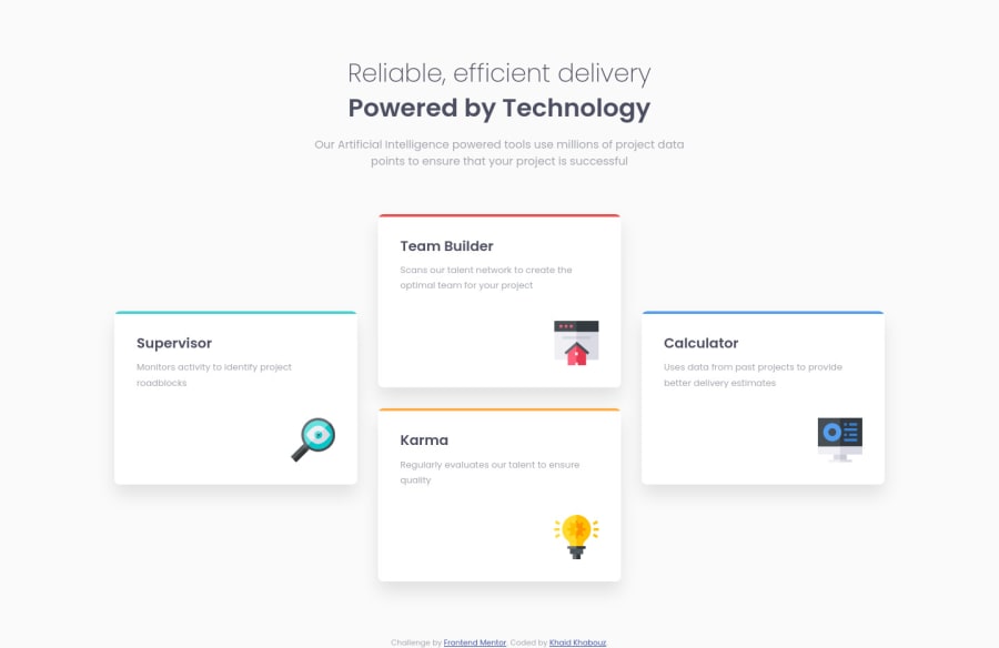
Four card feature section master using CSS & HTML
Design comparison
Solution retrospective
Thank you for stopping by, this is the final result of this challenge, using CSS, HTML, flexbox, media queries.
Community feedback
- @pikapikamartPosted almost 3 years ago
Hey, awesome work on this one. The desktop layout looks great, it is responsive though if go to like 770px upwards, not really an issue but just that the cards get differ in their sizes. You could go with something like a 2x2 layout so that it will be equal size. Mobile state looks great as well.
Here are some suggestions for the site:
- The
header
on this one could just be replaced bydiv
and be inside themain
tag this layout looks like just a single content or main-content. Typically, a primaryheader
consists of the site-logo, navlinks and some other controls for the site. - For the
h1
, you don't need to usebr
tag inside it to make the second text wrapped in another row, for this you could just usemax-width
on it. Adjust the value on it until you get the desired look. Just remember to addmargin: 0 auto
on it so that it will be centered. - For the
section
tag, you could just remove this since asection
tag is not informative enough unless it is labelled usingaria-labelledby
attribute or when there is already a visible heading tag on a section/part of the layout. So for this, adiv
could replace thesection
. - Since you are using
ul
tag, you should have created a 4li
tag and not 3 since visually, there are 4 items right. Use 4li
tag and usegrid
on theul
so that you could place each item properly like on the design. - For the colored top of each card, you could just use the
::before
or::after
of eachli
tag. This way, you won't have to create an extraspan
tag inside it. - For each icon of the card, you could just hide them since they are only acting as decoration. Decorative images are just images that doesn't contribute to the overall content of the site. They should be hidden for screen-reader at all times by using
alt=""
andaria-hidden="true"
to theimg
tag or onlyaria-hidden="true"
if you are usingsvg
instead ofimg
tag.
Aside from those, great job again on this one.
Marked as helpful1@KhalidKhabouzPosted almost 3 years ago@pikapikamart Thank you so much for stopping by, these suggestions were very helpful, I'm considering to apply them as they are for a professional result. Especially the HTML semantic tweaks, were very thoughtful. Thank you again for your professional feed back.
1 - The
Please log in to post a comment
Log in with GitHubJoin our Discord community
Join thousands of Frontend Mentor community members taking the challenges, sharing resources, helping each other, and chatting about all things front-end!
Join our Discord