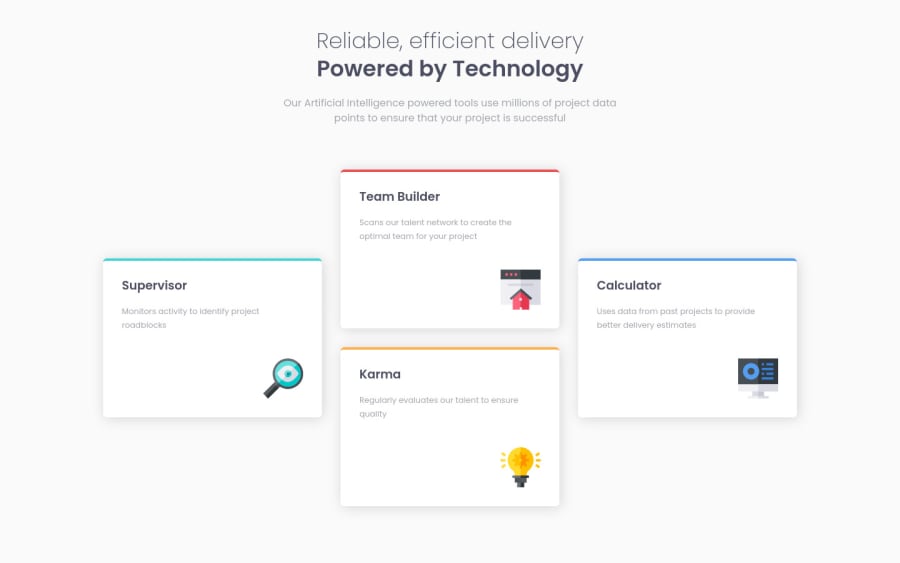
Design comparison
Solution retrospective
I used only CSS Flexbox for this project. Feel free to comment and give me some feedback. Thanks
Community feedback
- @VCaramesPosted about 2 years ago
Hey @gguilhermelopes, I actually just finished making this challenge. It will upload later today so can check it out.
Your card looks good, not much I would improve.
-
When building your challenges, you want to start mobile first. Since the majority of your users will browse your content via their mobile devices.
-
Replace the class="title" with a Header Element to make it semantically correct.
Question:
What was your reason for wrapping your cards in a Section Element instead of a Article or Div element? I had hard time deciding for mine...
Happy Coding!
Marked as helpful0@gguilhermelopesPosted about 2 years ago@vcarames Thanks for the tips! I guess I thought of the cards like a clickable element that expands somehow (hence the hover effect), each one explaining a little deeper it's content, so I chose the section. I'll make sure to check out your challenge!
0 -
Please log in to post a comment
Log in with GitHubJoin our Discord community
Join thousands of Frontend Mentor community members taking the challenges, sharing resources, helping each other, and chatting about all things front-end!
Join our Discord
