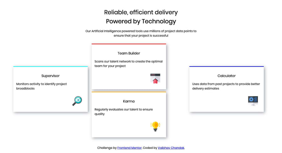
Four card feature section master solution using HTML and CSS
Design comparison
Solution retrospective
Is this code is good or can improve it. I am newbie.
Community feedback
- @AlexBueckigPosted about 5 years ago
Hi Vaibhav,
I saw you used
position: absolute;to position your cards. I'd recommend you to use the layout tools provided by CSS like flexbox or grid to position your elements instead of usingposition: absolute. You can find good tutorials on how to use them here: https://www.frontendmentor.io/resourcesI'd pick flexbox to start off with and when you are pretty familiar with it I'd have a look into grid. Both of them combined will allow you to create all kinds of amazing layouts.
2@Vaibhav-chandakPosted about 5 years ago@mattstuddert yeah, i started learning grids now.
0@Vaibhav-chandakPosted about 5 years agoThank you for the suggestion. I will checkout the course.
0@Vaibhav-chandakPosted about 5 years ago@AlexBueckig can you tell me some benefits or uses of using flexbox or grid instead of position:absolute. I am new in web development and just started learning. I don't know about flexbox or grid.
0@mattstuddertPosted about 5 years ago@Vaibhav121121 Hey Vaibhav! Just to follow up on this, using
position: absolutemeans you're essentially sticking elements to the page, meaning they get removed from the natural flow of the elements around them. This means you can get into much more difficulty with your layout.As Alex mentioned, I'd definitely take a look into Flexbox and Grid to learn more reliable ways of laying out your elements 👍
0
Please log in to post a comment
Log in with GitHubJoin our Discord community
Join thousands of Frontend Mentor community members taking the challenges, sharing resources, helping each other, and chatting about all things front-end!
Join our Discord
