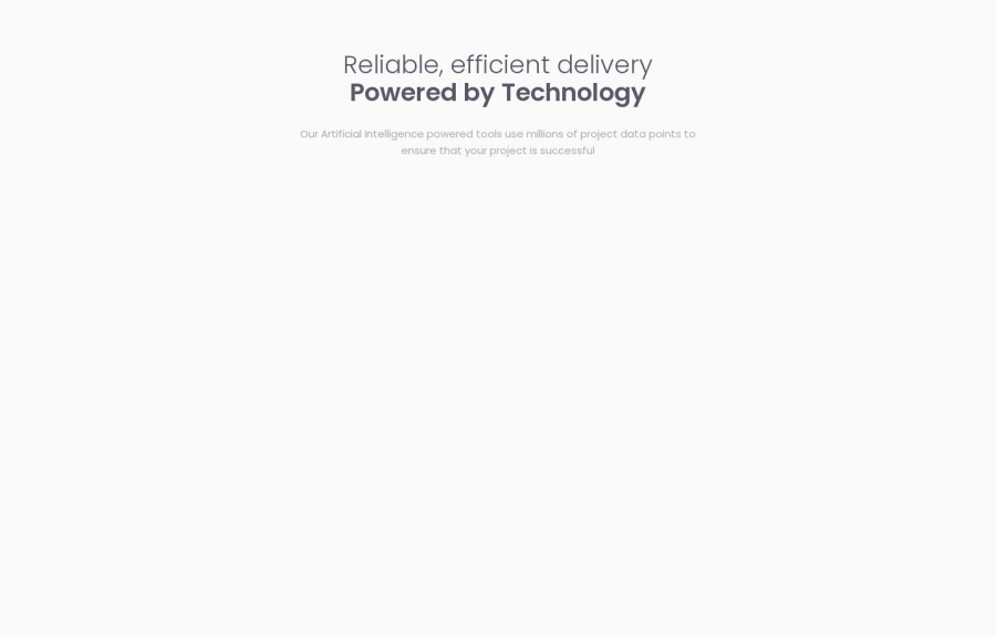
Four Card Feature Section | Frontend Mentor
Design comparison
Solution retrospective
If anyone has any feedback on how to improve, it's always welcome.
Se alguém tiver algum feedback sobre como melhorar, é sempre bem-vindo.
Community feedback
- @MelvinAguilarPosted over 1 year ago
Hello there 👋. Good job on completing the challenge !
Everything looks excellent, and I really like the solution! Just a small suggestion: it's advisable to avoid using hover animations on elements that don't trigger any actions. The hover effect on the
card__itemelement is visually appealing, but it might confuse users into thinking that the element performs an action when clicked, especially for those less familiar with web pagesI hope you find it useful! 😄
Happy coding!
Marked as helpful0@barcacaPosted over 1 year ago@MelvinAguilar
Hey, thanks for the feedback! Glad you like the solution. Good call on the hover animations. I'll tweak that
card__itemelement to avoid any confusion. Appreciate the heads up! 👍0
Please log in to post a comment
Log in with GitHubJoin our Discord community
Join thousands of Frontend Mentor community members taking the challenges, sharing resources, helping each other, and chatting about all things front-end!
Join our Discord
