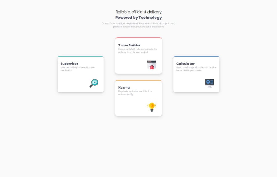
Design comparison
Solution retrospective
I'm proud of starting to use grid , I need to learn alot more and to be better with it .
What challenges did you encounter, and how did you overcome them?i was having trouble layering the cards in + shape ! I really dont know if i did a good job or not , but it seems to work .
What specific areas of your project would you like help with?fixing my grid . thanks !
Please log in to post a comment
Log in with GitHubCommunity feedback
- P@vstm
Congratulations on finishing that challenge, nicely done.
I have looked at your code with regards to the grid and there are some things I think you could do.
- You rely on
margin-top: 7em;to vertically center the boxes, this could be solved easier if you remove the margin-top and just setalign-items: centeron the.cards-container. Thealign-itemsandjustify-contentproperties are helpful to know here. - Inside the grid you wouldn't (or shouldn't) rely "margin" that often, you would rather use the
gapproperty to make the space smaller/larger (which you actually used)
Hope this helps as a first pointer, if you have any questions about my comment don't hesitate to ask.
- You rely on
- @SvitlanaSuslenkova
you don't have problems with grid itself, you should add max-width to cards-container.
also consider to move @media point because your desktop design doesn't fit in 600px screen and should not.
Join our Discord community
Join thousands of Frontend Mentor community members taking the challenges, sharing resources, helping each other, and chatting about all things front-end!
Join our Discord
