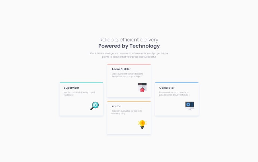
Four Card Feature Section Master developed in React, HTML and CSS
Design comparison
Solution retrospective
Coders:
This a project that we can mainly develop in HTML and CSS. However, I developed it in React using components and CSS for the styles. It was so useful to understand the HTML elements "figure" and "fig-caption". Also, in this project I used some parameters of the cards to define individual classes for each one.
Also, it was very useful to understand Flexbox to organize the different components of the User Interface and the use of media queries to switch between desktop and mobile versions. In this project I used a new format (at least for me) for mediaqueries in CSS with logical operators instead a format "min-width/max-width: 9999px"
Regarding the functionality of this challenge in react, I used a component "Card" to avoid repeating code and to have a reusable component receiving parameters, and this content in a "Cards" component.
Feedback are welcome.
Best regards guys.
Community feedback
- @NehalSahu8055Posted over 1 year ago
Hello Coder 👋.
Congratulations on successfully completing the challenge! 🎉
Few suggestions regarding design.
➨ Replace
align-item:flex-start;withalign-item:center;in body to properly center the card and background.I hope you find this helpful.
Happy coding😄
1@seismicmanPosted over 1 year ago@NehalSahu8055 Done! Thank you very much. I though that I have done it in that way, maybe it was the autofill of VScode 😄 Thanks
1
Please log in to post a comment
Log in with GitHubJoin our Discord community
Join thousands of Frontend Mentor community members taking the challenges, sharing resources, helping each other, and chatting about all things front-end!
Join our Discord
