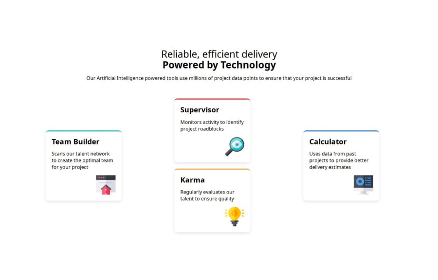


Design comparison

Solution retrospective
I am proud i was able to closely mirror the challenge
What challenges did you encounter, and how did you overcome them?Biggest challenge was learning grid. I went to my trusty cheat sheet to learn how to align child elements.
What specific areas of your project would you like help with?I need help learning grid. I wasnt sure to align my first and third card.
.card {
        display: flex;
        flex-direction: column;
        justify-content: space-between;
        align-items: flex-start;
        background: white;
        border-radius: 10px;
        box-shadow: 0px 4px 10px rgba(0, 0, 0, 0.1);
        padding: 20px;
        width: 250px;
        min-height: 200px;
        border-top: 4px solid transparent;

        img {
            align-self: self-end;
        }
    }
 .card:nth-child(1) {
        grid-column: 2 / 3;
        grid-row: 1;
        align-self: center;
    }


    .card:nth-child(2) {
        grid-column: 1;
        grid-row: 2;
    }

    .card:nth-child(3) {
        grid-column: 2;
        grid-row: 2;
    }
Community feedback
- P@MattJM1007Posted about 2 months ago
Hi Tommy! Great job working through this project! I'd like to help with your grid question.
In regards to placing the items in the same way as the design, I would make the grid to be 4 rows, instead of 2. This way you can position the items in a staggered way as in the design. I edited your code to add more rows and adjust where each card starts:
.hero {
        display: grid;
        grid-template-columns: repeat(3, 1fr);
        grid-template-rows: repeat(4, 1fr);
        gap: 20px;
        justify-content: center;
        align-items: center;
        padding: 40px;
        padding-inline-start: 150px;

        @media(width < 760px) {
            display: flex;
            flex-direction: column;
        }

.card:nth-child(1) {
        grid-column: 2 / 3;
        grid-row: 1 / 2;
        align-self: center;
    }


    .card:nth-child(2) {
        grid-column: 1;
        grid-row: 1 / 3;
    }

    .card:nth-child(3) {
        grid-column: 2;
        grid-row: 1 / 4;
    }

    .card:nth-child(4) {
        grid-column: 3;
        grid-row: 1 / 3;
    }
Hope this helps!
1 - @tflinchPosted about 2 months ago
Thank you for the feed back this helped me under stand better. The 4th row creates the additional space for the card to stay. the first card is from row 1/2 and the third card is from 1/4 expands all rows but sit directly in the 2nd column.
  .card:nth-child(1) {
    grid-column: 2 / 3;
    grid-row: 1/2;
    align-self: center;
  }
.card:nth-child(4) {
    grid-column: 3;
    grid-row: 1/3;
  }
0

Please log in to post a comment
Log in with GitHub
Join our Discord community
Join thousands of Frontend Mentor community members taking the challenges, sharing resources, helping each other, and chatting about all things front-end!
Join our Discord