

Design comparison

Solution retrospective
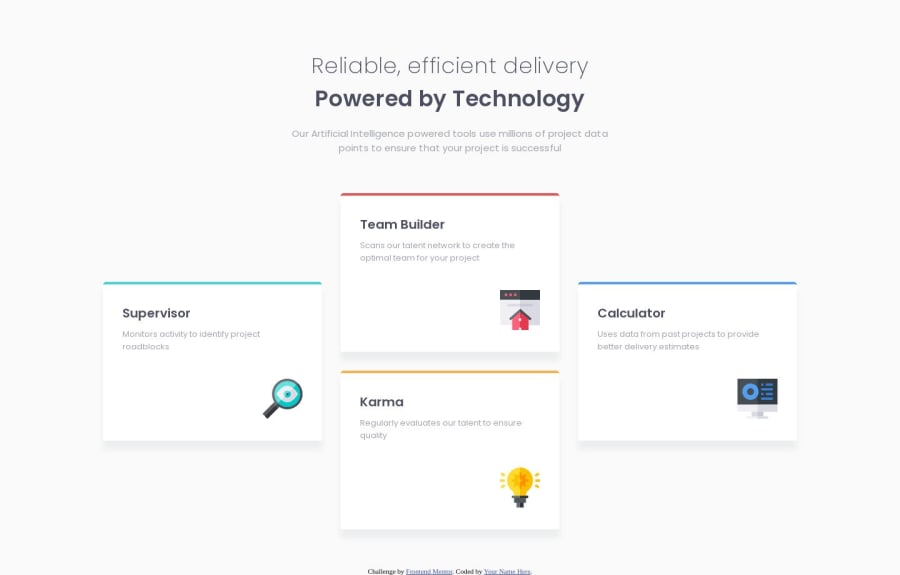
I picked up this project because of those 2 cards in the middle (Team Builder and Karma) displayed as columns instead of being displayed in a single row with the other cards (Supervisor and Calculator). I wanted to put my flex box skills to the test. I thought that it would be challenging but it wasn't... However I did try something different with this project, I used rems instead of hard coded values for the font-size, margins and paddings. I also used max-width and max-height instead of height and width. This workflow was suggested by Kevin Powell on YouTube. The final product turned out to be great thanks to the great design! I would like to thank the FrontEndMentor team for providing us with these free designs. Getting the opportunity to practice your skills on real life like projects is a great way to know where you're at and to improve. I would really appreciate it if you could take some minutes out of your time to review my code and give me some feedback. Don't mind the shadow box...It looks different than the one from the design, that's because I don't have access to the Figma file and I can't tell exactly what values were used.
Community feedback
Please log in to post a comment
Log in with GitHubJoin our Discord community
Join thousands of Frontend Mentor community members taking the challenges, sharing resources, helping each other, and chatting about all things front-end!
Join our Discord