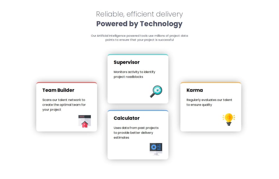


Design comparison

Solution retrospective
I am most proud of using both flexbox and grid to make a responsive design. I am also proud of finding good breakpoints based off of how my website was responding to the browser size, that way there aren't any choppy or awkward transitions.
What challenges did you encounter, and how did you overcome them?I had some issues with positioning the mobile layout. I was using position absolute and that was making some stuff work a little strange. I ended up modifying my HTML structure a bit, and then just used margin: auto instead. Another issue that I had was figuring out the best way to add the colored line at the top of each card, and I learned that you can use border-top: to give the container a different color, and then just setting the thickness of the line and making it solid.
What specific areas of your project would you like help with?I think the only thing is that I couldn't quite get the exact box shadow effect that was used in the designs, so I tried to make it as close as possible. Other than that, I feel like I was able to make a responsive page that transitions cleanly from mobile to tablet to desktop.
Please log in to post a comment
Log in with GitHubCommunity feedback
- P@CarlHumm
Hey Joel
Well done on completing the project! Nice to see how the design reacts to the inbetween breakpoints (tablet) and not just mobile.
Regarding the box-shadow
There are two quick ways you can select the box shadow with access to the design file.
Way 1 - Copy as
- Open up file in figma
- Select the background for an individual card (usually bottom layer/mask)
- Right click and select "copy as"
- Highlight "Copy as code".
- Select "CSS"
- Paste result in notepad and remove all besides the box-shadow.
Way 2 - View Properties in Effects Panel
- Open up file in Figma
- Select the background for an individual card (usually bottom layer/mask)
- Under Effects in the properties side panel, select effect settings for the box-shadow (small square button)
- Use Box Shadow Settings to write your own CSS or enter each result into a generator like this.
If you didn't have the design file, besides something like a generator, you could also use the shadow editor which is a default feature of chrome dev tools. This would allow you to live edit a shadow side by side with a browser one side and a design reference the other and get as close as you can.
I'm not an expert at figma (using free tier), so there may be a better way, this is just how I do it without any explicit design system/brand guidelines. Good luck on future projects!

Join our Discord community
Join thousands of Frontend Mentor community members taking the challenges, sharing resources, helping each other, and chatting about all things front-end!
Join our Discord