Design comparison
Solution retrospective
Hi everyone,
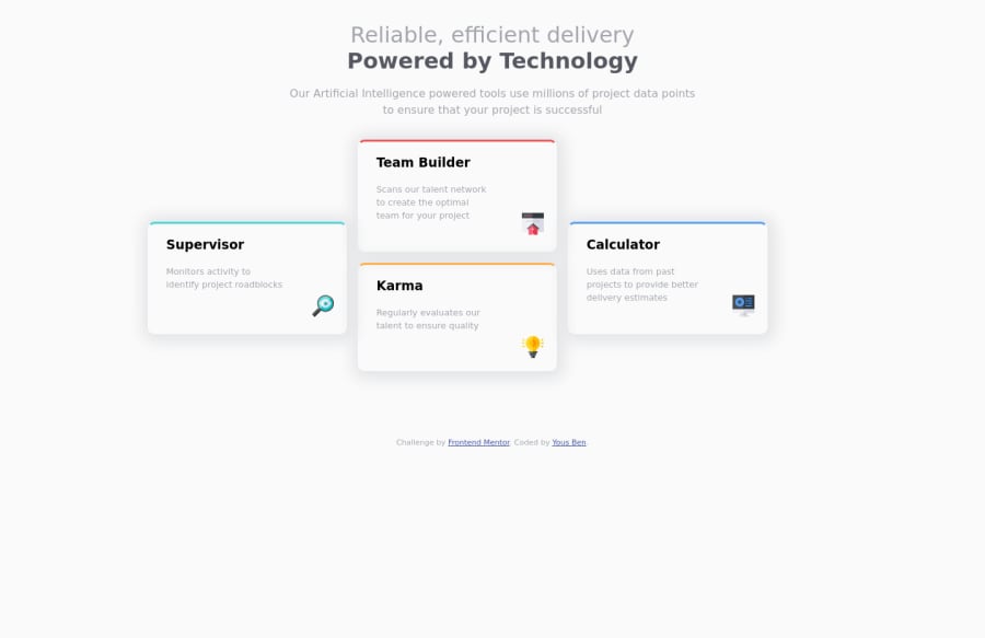
I just complete the challenge. I use Grid CSS and media queries for responsive website. Please, if you have any suggestions to improve, it will be a pleasure to learn from your expertise!
Happy coding and have a nice day !
Best regards, Yous Ben
Community feedback
- @grace-snowPosted over 2 years ago
Hi
I think you're getting confused when it comes to layouts. A few big issues you need to understand better
- Setting max-width in % means you lose all control over the widths. You don't know what 70% equates to as it all depends on a user's screen size. Instead, set max-width in rem for layouts. EG:
/* styles.css | https://yousra10.github.io/four-card-future-section-master/styles.css */ h1, .top-container { /* max-width: 70%; */ } p { /* max-width: 60%; */ max-width: 65ch; }
-
Your grid doesn't match at all what is needed here. You are setting sooooo many columns and rows (I'll add screenshot in slack). You should only be setting exactly what you need, then laying items out on that. In this case, that's (for desktop) I think it would be 3 columns and 4 rows. You may find using grid-template areas helps a lot to visualise where you're placing content instead of all the row and column number properties
-
You are using margin and padding in strange ways in the card. Create one card class to set the base properties on all of them like border-radius, padding, shadow, background color, top border. Then each card only needs its grid area setting and the border-color. Inside the cards, those elements only need vertical margin (not margins all over or padding) and the image can be right-aligned in various ways, but I wouldn't recommend absolute positioning. It would be easier kept in the document flow and adjusted with left margin auto or flex properties
Other that that only some minor adjustments to recommend:
- It should be one h1 not 2. You can use strong tag set to display block to create the line break in it
- Never jump heading levels. They must go in order (essential)
1@yousra10Posted over 2 years ago@grace-snow thank you very much for your suggestions! It’s very helpfull!!
0
Please log in to post a comment
Log in with GitHubJoin our Discord community
Join thousands of Frontend Mentor community members taking the challenges, sharing resources, helping each other, and chatting about all things front-end!
Join our Discord