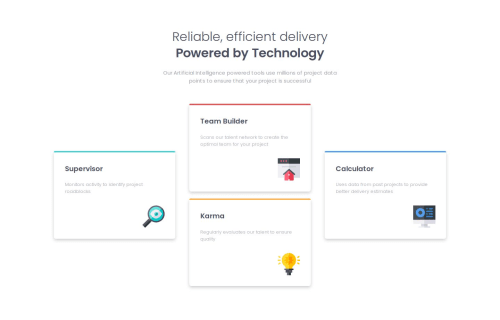
Submitted about 1 year agoA solution to the Four card feature section challenge
four-card-feature-section-master
@Lukas3162000

Solution retrospective
What are you most proud of, and what would you do differently next time?
I'm proud of getting better at flexbox
What challenges did you encounter, and how did you overcome them?Putting the coloured stripe ontop of the card-div. I googled a solution and asked chatgpt for advice.
Code
Loading...
Please log in to post a comment
Log in with GitHubCommunity feedback
No feedback yet. Be the first to give feedback on Car's solution.
Join our Discord community
Join thousands of Frontend Mentor community members taking the challenges, sharing resources, helping each other, and chatting about all things front-end!
Join our Discord