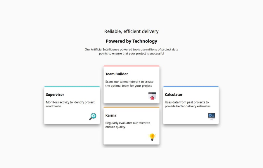
Design comparison
SolutionDesign
Please log in to post a comment
Log in with GitHubCommunity feedback
- P@tobaojo
Good effort.
Your font doesn't seem to be coming through.
A few pointers:
In your media query, the
.cardswitches to a flex layout on screens smaller than550px. However, if the intention is to make.card-oneoccupy full width, addingwidth: 100%to.card-onemay help achieve a consistent look.
Join our Discord community
Join thousands of Frontend Mentor community members taking the challenges, sharing resources, helping each other, and chatting about all things front-end!
Join our Discord
