Design comparison
SolutionDesign
Please log in to post a comment
Log in with GitHubCommunity feedback
- @Iruburu
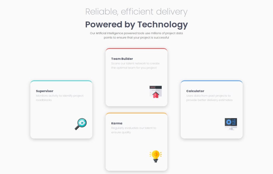
Tente usar esse código no css do cartão para ficar melhor:
.main .features .card { overflow-x: hidden; background-color: white; max-width: 363px; min-height: 240px; margin: 0 auto; border-radius: 8px; box-shadow: 0 5px 25px -5px var(--Grayish-Blue); } .main .features .card::before { content: ''; display: block; width: 100%; height: 4px; background-color: black; }Marked as helpful
Join our Discord community
Join thousands of Frontend Mentor community members taking the challenges, sharing resources, helping each other, and chatting about all things front-end!
Join our Discord
