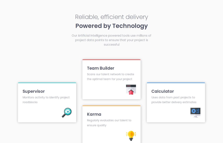
Design comparison
SolutionDesign
Solution retrospective
What are you most proud of, and what would you do differently next time?
First time using both Flexbox and CSS Grid
What specific areas of your project would you like help with?Does using Flexbox instead of CSS Grid until reaching breakpoint of 1024px (written as 64em
) width considered as optimal for layout?
Community feedback
- @SergioCasCebPosted 6 days ago
Hey there, well done with your solution. I specially like that you added another view between the mobile and the desk one provided by the exercise, that was well though out.
There are a few tip I could give for future consideration though:
- I noticed that for the small and medium view you are utilizing
Flexbox
and for the desktop view you change toGrid
. Why not save some extra lines of code and just utilize Grid for the whole layout. - Also this is really subjective and depends on your project, but the sizing of everything could be a bit smaller. (Again just personal preference)
Marked as helpful1 - I noticed that for the small and medium view you are utilizing
Please log in to post a comment
Log in with GitHubJoin our Discord community
Join thousands of Frontend Mentor community members taking the challenges, sharing resources, helping each other, and chatting about all things front-end!
Join our Discord