Design comparison
SolutionDesign
Community feedback
- @carlosmarte23Posted 6 months ago
Hello!
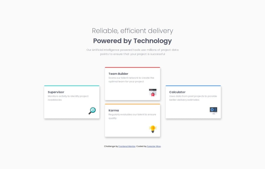
Great job with your code! The desktop version follows the design quite well. However, I noticed some issues on the mobile version, especially with the headers—they seem to be cut off at the top. Also, the breakpoint between mobile and desktop views might be set a bit too high, so you may want to revisit that.
I'd love to give more detailed feedback, but I'm still learning myself. I hope this helps and that you can make some improvements!
Marked as helpful0
Please log in to post a comment
Log in with GitHubJoin our Discord community
Join thousands of Frontend Mentor community members taking the challenges, sharing resources, helping each other, and chatting about all things front-end!
Join our Discord
