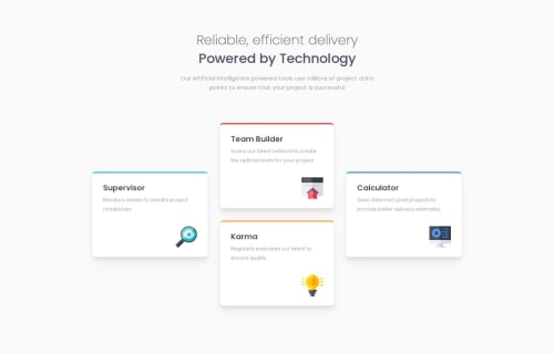
Four Card Feature Section

Solution retrospective
I’m pleased how well the design scales across different screen sizes, keeping everything clean and functional with Tailwind CSS utilities. I paid close attention to accessibility, using proper HTML5 semantics and making decorative icons "invisible" to screen readers (alt="" and aria-hidden="true").
Next time, I’d focus more on adding subtle interactions like hover effects and improving typography scalability, especially for smaller screens. I’d also like to spend more time testing on a wider range of devices and consider features like dark mode for a more complete user experience.
What challenges did you encounter, and how did you overcome them?The biggest challenge was ensuring that the design remained responsive and visually balanced across different screen sizes. To overcome this, I relied heavily on Tailwind’s responsive utilities (sm: and md:) and experimented with flex and grid for consistent spacing and alignment.
I’d love feedback on how I used Tailwind utility classes to achieve the design. I’m particularly curious to know if there’s a simpler or more efficient way I could have structured things, particularly around layout, spacing, and responsiveness.
Please log in to post a comment
Log in with GitHubCommunity feedback
No feedback yet. Be the first to give feedback on Josh Boys's solution.
Join our Discord community
Join thousands of Frontend Mentor community members taking the challenges, sharing resources, helping each other, and chatting about all things front-end!
Join our Discord