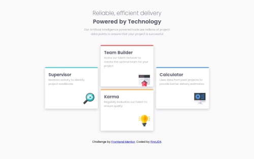
Not Found
Not Found
Not Found
Not Found
Not Found
Not Found
Not Found
Not Found
Not Found
Not Found
Not Found
Not Found
Not Found
Not Found
Not Found
Not Found
Not Found
Not Found
Not Found
Not Found

Submitted

Four Card Feature Section

FinnJ04 100

@FinnJ04

Desktop design screenshot for the Four card feature section coding challenge

This is a solution for...

  • HTML
  • CSS
1newbie
View challenge

Design comparison


SolutionDesign

Solution retrospective


Used grid properly in this project for the first time. Only thing I am not quite happy about is that the cards move to the right once the window gets too small (and hasn't changed to mobile version yet). Feedback on this problem is very much appreciated!

Community feedback

@anthonyplicata

Posted

Nice job on using grid! It's a great feeling when that one clicks. If you center everything on the page it will prevent everything from moving off just to the right. Using margin: 0 auto; is a very helpful in centering things. Always sneaks up on me when I'm trying to align something left or right and forget that the margin is set somewhere😅. Responsive size values like % or vw/vh will help with the boxes changing as you manipulate the screen size. Setting the width to 100% and the max-width to something of your choice might give you a better scaling of the cards.

0

Please log in to post a comment

Log in with GitHub
Discord logo

Join our Discord community

Join thousands of Frontend Mentor community members taking the challenges, sharing resources, helping each other, and chatting about all things front-end!

Join our Discord