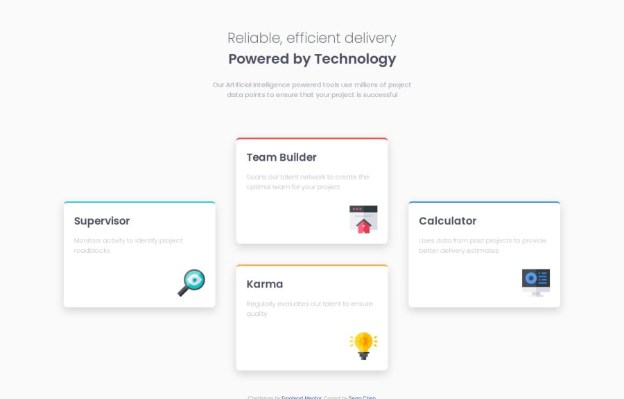
Design comparison
Solution retrospective
This is my first time creating a project using CSS grid. It was challenging, but overall it gave me a perspective on how to design responsive layouts for both mobile and desktop. Utilizing the mobile first approach definitely helps with writing the initial CSS and adding more CSS for desktop version is much easier as it reduces repeating code.
What challenges did you encounter, and how did you overcome them?Challenging part was getting the grid to work with the desktop. Looking into grid-template-areas and grid-area really helps as it helps with organizing the card components in a certain way.
I would like more guidance on how to utilize CSS grid more efficiently.
Please log in to post a comment
Log in with GitHubCommunity feedback
- @Mostafa-M-Abbas
awesome
Join our Discord community
Join thousands of Frontend Mentor community members taking the challenges, sharing resources, helping each other, and chatting about all things front-end!
Join our Discord
