Design comparison
SolutionDesign
Solution retrospective
Hello,
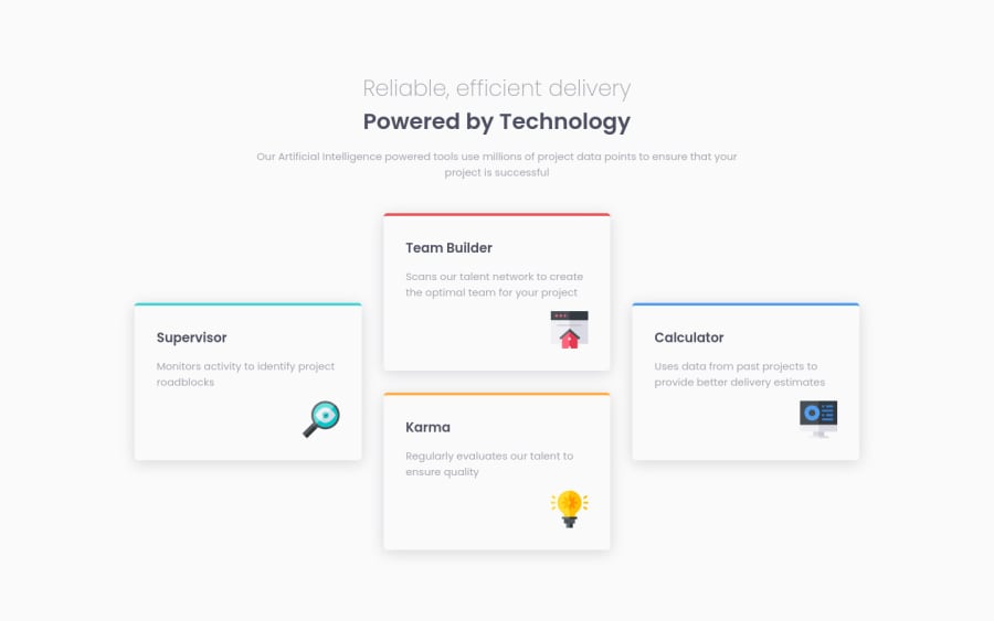
- When the screen shrinks to 820px, icons in the card got displaced. How do I avoid it?
Community feedback
- P@EdwinSchPosted over 2 years ago
Hey! So what's happening with the displacement here; while the screen get's smaller, the sentences 'wrap' words to the next line to account for the width getting smaller. Thus the text(element) actually gains height, pushing to next element (your icons) downwards. There are multiple ways to solve this, but the fastest would be to just change your breakpoint before it's starts wrapping words to a new line.
1
Please log in to post a comment
Log in with GitHubJoin our Discord community
Join thousands of Frontend Mentor community members taking the challenges, sharing resources, helping each other, and chatting about all things front-end!
Join our Discord
