Four Card Feature Section

Solution retrospective
It was a fun project to make.
My main takeaways were.
-
When you give sizing to SVGs and also pictures most of the time its best to use px and not Rem, because if you give Rem your SVGs or Images will grow as your responsive design by increasing screen size.
-
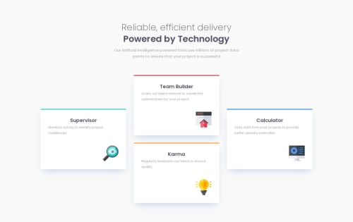
The way the 4 cards are positioned in a cross pattern,when using CSS Grid, it is not very intuitive how many rows and columns to make, because the side column visually look like they start in the middle of grid cells. You solve this problem by giving each card 2 row cells. I used a Grid of 3 columns and 4 rows to create the design.
Thank you for reading.
Please log in to post a comment
Log in with GitHubCommunity feedback
No feedback yet. Be the first to give feedback on Iggy19944's solution.
Join our Discord community
Join thousands of Frontend Mentor community members taking the challenges, sharing resources, helping each other, and chatting about all things front-end!
Join our Discord