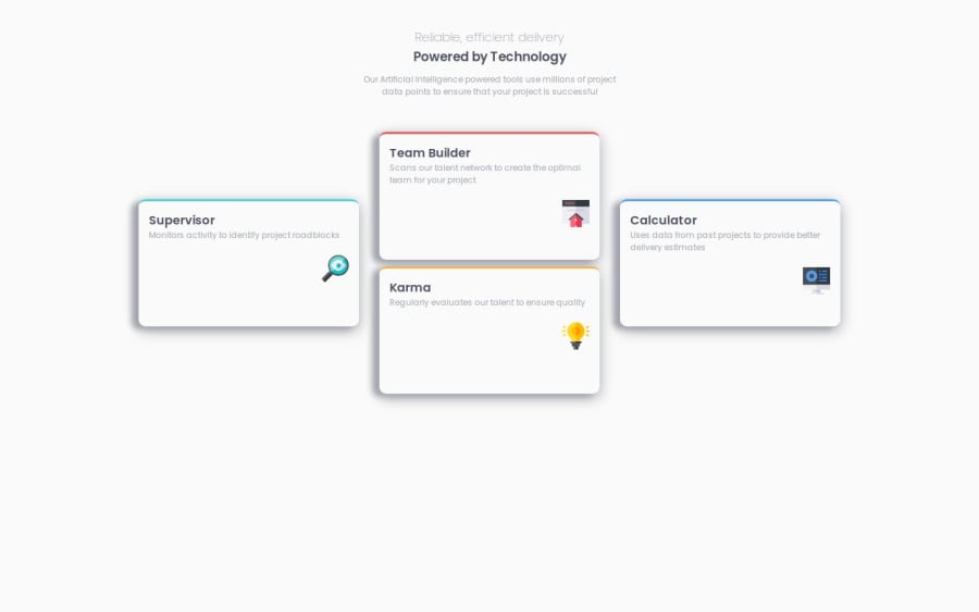
Design comparison
Solution retrospective
I got the Media Query on this section to look better, as it was a little bit troubling trying to get it right.
What challenges did you encounter, and how did you overcome them?The Media Query , and some of the mistakes I did made me take more time then i wanted too
What specific areas of your project would you like help with?The Media Query area, if there is any type of issues on it.
Please log in to post a comment
Log in with GitHubCommunity feedback
- Account deleted
Congratulations on completing the challenge, Nebil! Your design is well-responsive.
I have a suggestion that'll help you with Flexbox. Consider adding the
gapproperty to your design. Althoughjustify-content: space-evenlyworks for this project, when the screen is resized, the space between the boxes does not remain the same, resulting in the boxes being too close together. By usinggap, the size of the gap between your boxes will remain the same, even when you resize the screen.I hope you find this helpful. Other than that, great job!
Marked as helpful
Join our Discord community
Join thousands of Frontend Mentor community members taking the challenges, sharing resources, helping each other, and chatting about all things front-end!
Join our Discord
