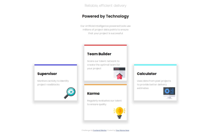
Design comparison
SolutionDesign
Please log in to post a comment
Log in with GitHubCommunity feedback
- @yaywonah
- Your HTML and CSS were easy to read and follow along.
- I would suggest changing the px values of your margin, width, padding, and font sizes to em/rem, so that the layout is more responsive.
- The card divs in your mobile media query touch the edges of the screen once it hits less than 400px. I would change the
.col1, .TeamBuilder, .Karma, .col3 {
width: 100%
}
to a smaller value like
width: 80%- I'd also change the margins of your h2 and h1 elements in your
titlediv so that there's less space between them. That way it can look more like the design.
Join our Discord community
Join thousands of Frontend Mentor community members taking the challenges, sharing resources, helping each other, and chatting about all things front-end!
Join our Discord
