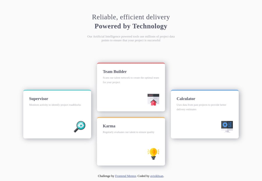
Four card feature section (HTML,CSS with FlexBox) + Responsif
Design comparison
Solution retrospective
hello this is my first challenge sorry i'm still newbie
please give me feedback.
thank's ^_^
Community feedback
- @gretagrPosted almost 5 years ago
Hey, congrats on your first solution! I think your code is actually quite neat! You use HTML5 tags really nicely! (maybe you don't need the div's around article tags tho). However, I have some thoughts about the design itself:
- Your cards are way too big.
- There is no spacing around cards when the screen gets smaller.
- Heading text overlaps text below it on a mobile screen, and cards do not fit the screen.
- As mentioned before - you forgot to use given fonts.
Now, it might seem to be not so much of an issue (the code is good, right?), but as a frontend developer, your goal is to get the website looking as close to the design as possible, so I thought this kind of feedback might be useful too :)
Good luck on your next projects, you're off with a good start!
1 - @Axel01011111Posted almost 5 years ago
Hey, it looks great. You could check the fonts and the title part on the mobile design, but everything else is good in my opinion
1 - @gadroxjrPosted almost 5 years ago
To be honest, I prefer sans serif type fonts, like Roboto or others. You can find alternative fonts from Google Fonts. The shadow on each card is also too thick. You can reduce the opacity so it's not too thick. Good job for your first challenge! Keep going!
1
Please log in to post a comment
Log in with GitHubJoin our Discord community
Join thousands of Frontend Mentor community members taking the challenges, sharing resources, helping each other, and chatting about all things front-end!
Join our Discord
