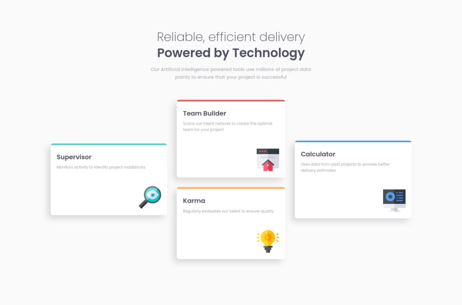
Design comparison
Solution retrospective
Hello Everyone! π
I was doing this challenge on my Android phone. Hopefully, it looks good on your deskop. π
Of course, any feedback is appreciated!
That's it! Happy coding everyone!
Community feedback
- @Gascoigne09Posted over 3 years ago
This is an incredible effort if its something you've done on your phone.
There is one small detail I'd like to address, when the viewport hits its breakpoint, your karma and team builder containers are slightly smaller than the ones on left and the right, but as the viewport increases the problem is very quickly resolved.
It's a tiny detail i'm bringing up but again shows you've done a great job. :)
1@vanzasetiaPosted over 3 years ago@Gascoigne09 Thanks you for your kind words and also the feedback! About the karma and team builder containers, the parent of all three cards, I used
display: flex
and also I made it the direct children to beflex: 1 1 100%
, so that way it will have the same width. But unfortunately when it hits the breakpoints something a little weird happen. If you have any solution for this problem, I will be glad to know that!0 - @buneeIsSloPosted over 3 years ago
@Vanza, This is Perfect! and completely responsive. I am amazed by the fact that you coded this on a phone. If you don't mind me asking, Can you please share some resources that you used to achieve this? By that I mean, How you went about making this site perfectly responsive on a phone and apps that you used to code etc.... Looking forward to your next solution :)
1@vanzasetiaPosted over 3 years ago@buneeIsSlo Thank you for your kind words! I really appreciate it!π And about the apps that I used, I use Acode as my code or text editor (which is a really nice π code editor for Android) and to compile my Sass to CSS I need a terminal to install nodejs then install Sass and other things. So the terminal that I currently use is Termux and the browser that I use is Chrome. And last but not least, for the resources I usually take a look on documentation whether it's on W3Schools and MDN. That's it! Hopefully this answer your question π!
1@buneeIsSloPosted over 3 years ago@vanzasetia Thank you SO much for sharing these resources. Happy Coding! :)
0@vanzasetiaPosted over 3 years ago@buneeIsSlo You're welcome! And also if you still have any questions, feel free to ask me! I will be very happy to answer them!
Happy Coding Too!
1 - @ApplePieGiraffePosted over 3 years ago
Hi, Vanza Setia! π
I just wanted to drop in and check out another challenge of yours that you have completed! π This one's looking great, as well (and is better than a lot of solutions for this challenge I've seen which have probably been coded on a regular laptop or desktop computer)! π I like how you nicely organize your code, too. π
The only small suggestion I have is to use a single
<h1>
tag for the heading of the page (since it is really just a single heading, not two separate headings). You can easily style each part of the heading differently by wrapping one part in a<span>
tag. πYou're doing a wonderful jobβkeep it up! π
And of course, keep coding (and happy coding, too)! π
0@vanzasetiaPosted over 3 years ago@ApplePieGiraffe Thank you for your kind words and your suggestion!
0
Please log in to post a comment
Log in with GitHubJoin our Discord community
Join thousands of Frontend Mentor community members taking the challenges, sharing resources, helping each other, and chatting about all things front-end!
Join our Discord