Design comparison
Solution retrospective
Hi All Coders.
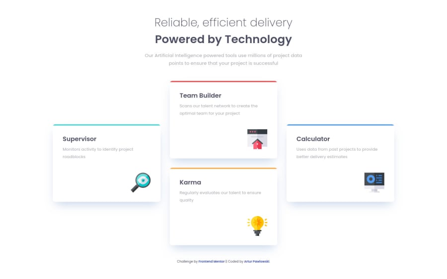
It's my 7th Challenge here. I tried to make this "Four Card Feature Section" as much close look to the Figma file I download. I think it is very close.
Let me know what you think.
Happy coding to everyone 🐱🏍🎉
Community feedback
- @mattstuddertPosted over 3 years ago
Hey Artur,
Great job on this challenge! Your project is definitely a good representation of the design! Here are a couple of pointers I thought about after looking at your HTML code:
- You don't have a
h1
on this project as it stands. I'd always recommend having a singleh1
. For this project, it would be where you've got theh2
headings. Except, I'd have it all as a singleh1
withspan
elements inside to differentiate the styles. This means the cards headings would becomeh2
s. - For the images, I'd keep the
alt
value empty. This will make screen readers skip over them. In this instance, that's a good thing, as thealt
text is currently repeating the exact text in the card headings and adds no extra context.
I hope these tips help. Keep up the great work! 🙂
1 - You don't have a
- @ApplePieGiraffePosted over 3 years ago
Hey there, Artur! 👋
Good work on this challenge! 🙌 Like Matt mentioned, your solution looks pretty good! 👍
One thing I'd like to suggest is that you consider adding a max-width to the feature cards (and horizontally centering them in the page if need be) so that they aren't too wide when the layout first changes from desktop to tablet/mobile. 😉
Keep coding (and happy coding, too)! 😁
0
Please log in to post a comment
Log in with GitHubJoin our Discord community
Join thousands of Frontend Mentor community members taking the challenges, sharing resources, helping each other, and chatting about all things front-end!
Join our Discord