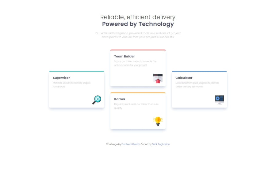
Four Card Feature Section: HTML, Grid, Tailwind-CSS
Design comparison
Solution retrospective
I'm proud I learned how to use grid with more precision. Next time I will add additional breakpoints (in this case for the text size of the h1 tag) where needed. I noticed the title could use an increase in size on the mobile version.
What challenges did you encounter, and how did you overcome them?Surprisingly, this project went smoothly. I just kept the flow of working and solved each section step-by-step. I did overcome an issue I had from my last project, browser compatibility. I used Arc to preview my work and it transitioned nicely to other browsers.
What specific areas of your project would you like help with?I don't need help on this project.
Community feedback
Please log in to post a comment
Log in with GitHubJoin our Discord community
Join thousands of Frontend Mentor community members taking the challenges, sharing resources, helping each other, and chatting about all things front-end!
Join our Discord
