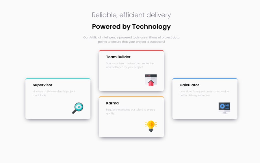
Design comparison
SolutionDesign
Solution retrospective
👋🏻Hi everyone!👋🏻
It was quite a tricky project!
I tried to explore SASS functions a little bit more (like @mixin).
I also tried CSS Grid and really enjoyed it! Combined with flexbox it's a very powerful tool.
Still counting on your feedback!
Have a nice day!
Community feedback
- @EmmanuelHexerPosted almost 3 years ago
Great work overall man. Keep it up You can also check mine to see how i did it.
Marked as helpful2 - Account deleted
Hi there 👋
Congratulate on finishing your project 🎉. You did a great job 💡
I give some suggestions to help you take your project design to the next level 📈😉
- Decrease the border-top of all cards to
3px - I am sure the exact color of it but the box-shadow color should be some kind of light blue
Happy coding ☕
Maqsud
Marked as helpful1 - Decrease the border-top of all cards to
- @AndyGlz01Posted almost 3 years ago
Nice Job! Box-shadow needs some work and font-size of card text, I think.
Marked as helpful1
Please log in to post a comment
Log in with GitHubJoin our Discord community
Join thousands of Frontend Mentor community members taking the challenges, sharing resources, helping each other, and chatting about all things front-end!
Join our Discord
