Design comparison
Solution retrospective
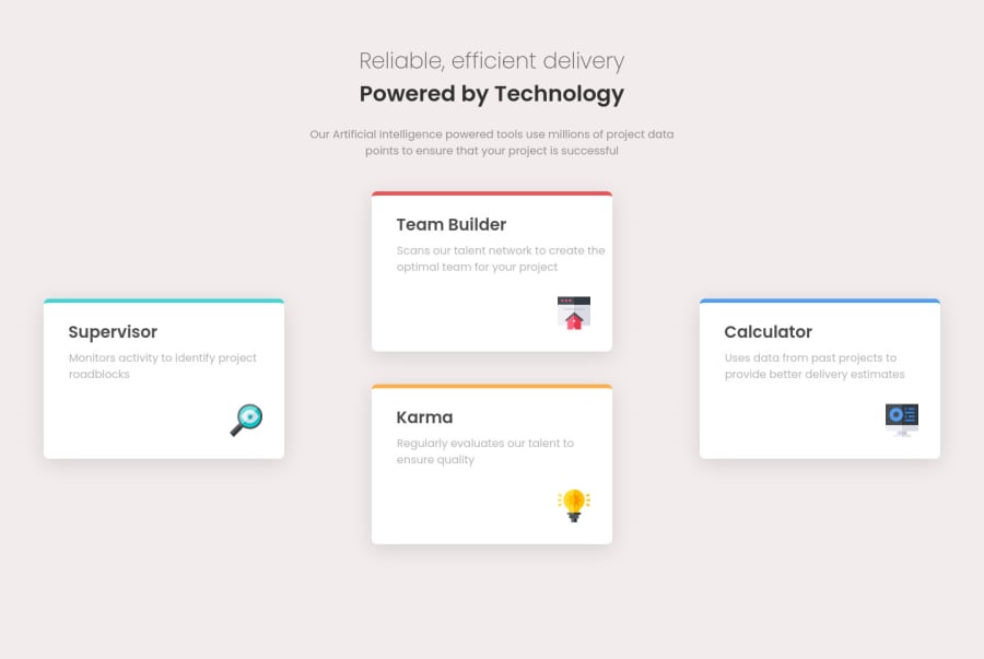
Hello everyone! This is my solution for Four card feature section. Feedbacks are appreciated.
Community feedback
- @dwhensonPosted about 2 years ago
Hello Ahmend, 👋
Nice work here! This is a tricky one, you've got some of the hard details like the top border sorted - that really gave me problems for a long while! Here's a few things you might like to consider:
- You are using
gridon the main section, which is great, but not really getting the maximum benefit from this property. If you're new to it I'd suggest checking it out as it can be super helpful.
In this case, you are using grid, but then also using margin to position elements, I'd go for one or the other (in this case grid most likely!). I'd suggest trying a grid with 4 rows, and 3 columns. And then have each card span the two rows it needs to (so the top card would be rows 1 and 2, and the middle cards 2 and 3, and the bottom card rows 3 and 4 - you'll also need to specify which column they should go in).
Then if you use the
gapproperty, rather thanmarginyou should have a nicely laid out desktop page. You can then change the grid layout with a media query for mobiles (I'd actually probably start with the mobile view and then put the settings above in a media query for desktop, but it doesn't matter really).This is a bit of a tricky one to explain, but I hope you get the gist of what I am trying to say. If not just let me know and I'll try and clarify!
Cheers Dave
Marked as helpful1@nerdy-guyPosted about 2 years ago@dwhenson Thanks Dave! I will look into grid properties, I have only used grid to make columns.
0 - You are using
Please log in to post a comment
Log in with GitHubJoin our Discord community
Join thousands of Frontend Mentor community members taking the challenges, sharing resources, helping each other, and chatting about all things front-end!
Join our Discord
