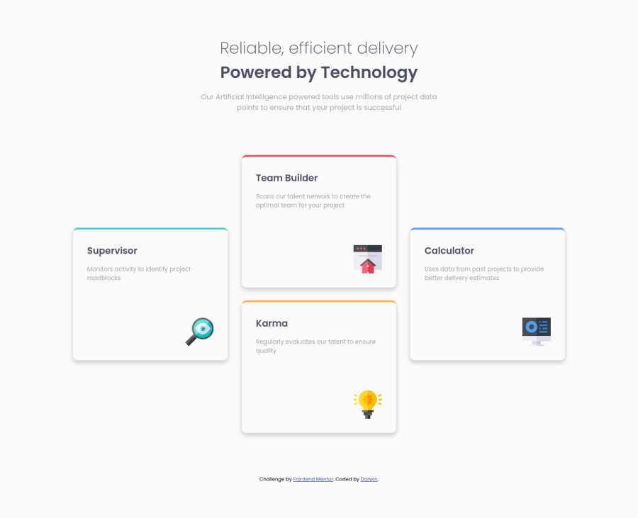
Design comparison
Solution retrospective
Any feedback is very welcome, I've learned some solutions from PhoenixDev22, such a great mentor to follow, waiting for your comment bro, cheers, and happy coding
Community feedback
- @ayminahmedpkPosted almost 3 years ago
Looks decent. However, there's a few ways you can raise your game.
I noticed there is an animation when moving from mobile to 'laptop layout', but not when moving to the desktop layout. Consistency is actually a big part of UX. Try to have the animation in both cases or in neither case, because it's jarring when it only happens on some occasions. But if you're just experimenting, then congrats, it works and looks ok.
There's a few other things you could do too. You can make the design more accurate by using PerfectPixel extension on Chrome to fine tune your style, and you can use Figma to map out the image so you know the exact fonts and box sizes.
Also, consider using Grid, that way you can get rid of the 3 'left', 'middle' and 'right' divs. It'll help you simplify your markup as well as your CSS.
Finally, if you're going to restart and resubmit this challenge, look into BEM as well.
If you look at my profile, I have submitted this challenge with a Figma file (my own, not from FEM), so you can get it from my repository and use that as an example. Also, I've made a previous comment for this same project explaining all of this in more detail, so that might help you out too.
BTW, I did this challenge twice. My first submission was with Flex, and the second one was with Grid, so if you want to compare the code you can check my commit history for that repo.
Marked as helpful0 - @cxkeeleyPosted almost 3 years ago
wow, I already saw yours, and your solution is almost 100% perfect, great job, I'm still learning about SCSS and BEM, I will follow your advice. thanks
0@ayminahmedpkPosted almost 3 years ago@cxkeeley Sure, no problem. BTW if you are interested in the code, make sure to focus on the .scss files, the .css files are generated automatically so the code in those is not easy to understand at all. You'll learn that when you start using SASS yourself.
0
Please log in to post a comment
Log in with GitHubJoin our Discord community
Join thousands of Frontend Mentor community members taking the challenges, sharing resources, helping each other, and chatting about all things front-end!
Join our Discord