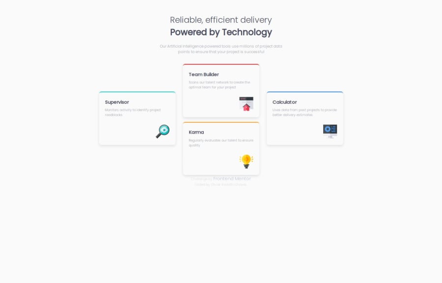
Four card feature section [HTML & SASS]


Design comparison

Solution retrospective
To make it look as similar as I could to the design, I'm sure there are other ways and at one point I thought it would end up ugly, but it turned out pretty :D
What challenges did you encounter, and how did you overcome them?The first was that I read that sass was used for CSS and the truth is that it is a very interesting support, I'm sure it can be used better, then the cards, I tried several ways but in the end it looked good with Grid, it also needed quite a bit of responsiveness, I have to review how to review it better at "local"
What specific areas of your project would you like help with?Mmm, in the responsive sizes, I would like everything to maintain a scale and decrease or increase it, I wonder if it is possible, and if it is, it may not be as simple as I imagine XD
Community feedback
- P@RahexxPosted 5 months ago
Good job on this challenge! I agree that the result looks nice and is close to the original design. Although it’s a slightly smaller version, with more practice, I'm confident your skills will improve, and your applications will get even closer to the design specifications.
Here are a few tips that might be useful:
- Consider using the BEM methodology for naming classes. Names like "L1" or "L2" don’t convey much meaning, so using BEM can make your classes more descriptive and maintainable. (BEM 101)[https://css-tricks.com/bem-101/]
- Limit the use of
h1tags to one per page. Anh1represents the main title of the page, so avoid using multipleh1tags. Instead, use smaller headings likeh2orh3where needed. - Remember to use descriptive
altattributes for accessibility. For instance, "Supervisor_Icon" doesn’t provide much information to visually impaired users. Instead, a description like "magnifying glass with an eye inside" would be more helpful. - Consider using semantic HTML tags such as
sectioninstead of adivfor a card. This can improve the semantic structure of your page. - Great job using
@mixins! To take this further, try reading about responsive design breakpoints. By setting multiple breakpoints and adapting styles progressively, you’ll achieve a layout that’s even closer to the design on all screen sizes. Overall, great job!
Marked as helpful0

Please log in to post a comment
Log in with GitHub
Join our Discord community
Join thousands of Frontend Mentor community members taking the challenges, sharing resources, helping each other, and chatting about all things front-end!
Join our Discord