

Design comparison
SolutionDesign

Solution retrospective
What specific areas of your project would you like help with?
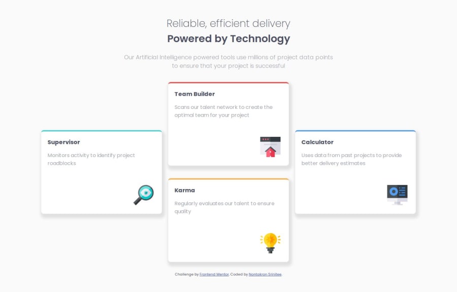
I want to know is there anyway better then using position: relative; on logo image cause when the monitor change size image in card still in the same position it not responsive so I think there might be a better way than position: relative;
Please log in to post a comment
Log in with GitHubCommunity feedback
- @KapteynUniverse
Hey DuyDui,
You can use flex or grid on the cards and align-self to the icons. But instead of your way, you can also apply absolute to the images and relative to the cards and position images relatively to the card div.
.card_logo {
    position: absolute;
    right: 5%;
    bottom: 5%;
}

.card {
    position: relative;
}
For example
Marked as helpful - @Basselfathy
Hi @DuyDui.
I have handled the card logo like this..
.card{
    display: grid;
    gap: 2.5rem;
    padding: 2rem;
}
.card-logo{
    width: 4rem;
    justify-self: end;
}
And for the cards container, I used
gridinstead offlex.


Join our Discord community
Join thousands of Frontend Mentor community members taking the challenges, sharing resources, helping each other, and chatting about all things front-end!
Join our Discord