Submitted almost 4 years agoA solution to the Four card feature section challenge
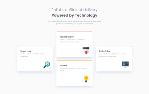
Four Card Feature Section | GRID | Mobile First

@NickODxyz
Solution retrospective
Hi all,
This was my first attempt at using GRID. I'm pretty pleased with the way it came out in the end. Having never used grid, there were a lot of properties to take in.
If someone could take a look at how I used it and let me know if I could have made the code any cleaner that would be great.
I also made a lot better attempt at making the page fully responsive, please let me know your thoughts on that.
Thanks, Nick
Code
Loading...
Please log in to post a comment
Log in with GitHubCommunity feedback
No feedback yet. Be the first to give feedback on Nick OD's solution.
Join our Discord community
Join thousands of Frontend Mentor community members taking the challenges, sharing resources, helping each other, and chatting about all things front-end!
Join our Discord