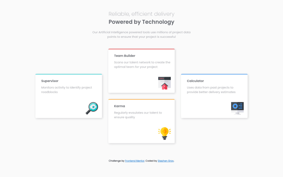
Design comparison
Solution retrospective
FEEDBACK WELCOME!
I decided against mobile view as I am only 1 month into my journey and want to feel comfortable using HTML/CSS to make these sites before I start messing with mobile view as I want to get a sound understanding of one before the other.
I also learned how to use basic Transition/Transform on this project to try and give it a little more life!
Overall I am happy with the outcome and thought I would struggle a lot more than I did but within just over an hour I managed to get it as close as I deem a decent portrayal. Especially as I did not have access to Figma files to get a better understanding of the design behind it!
Community feedback
- @ChamuMutezvaPosted almost 2 years ago
Hi So far so good with the project. Here are some issues that you must rectify HTML
- It's is good that you have included elememts such as
main and footer
in your html. Since you have the section element with the class ofheader
, I would advice to change the section element to a header element. Such elements have semantic meaning than a div or a section element. - For best practices , your site should have only one h1 element. Remember that styling can be achieved by css. I suppose that should have been one h1 heading element styled different at the end. Either wrap the bold part in a span that will be a child to the h1 element
- The order of heading elements is that , they should follow a sequential order. An h1 heading element should be followed by an h2 element, you can not jump to an h3 or an other element. That is , if you need another heading element after an h2 element, then that heading element should be an h3 . In this challenge , the other headings in the cards should all be h2 heading elements.
- when writing alt values, avoid words such as
image, picture, graphic
etc, those words are automatically announced by screen readers. The alt value is meant to send a message that is contained in the image - not telling what the is. Some images are decorative and will require an emptyalt=""
value. I would havealt=""
for these images
CSS
- starting mobile first is generally recommended. That is your initial styles should be covering for mobile devices. It is important to note that content flows from top to bottom by default which is what mobile devices's layout is like. You then starting adding media queries when necessary.
- since the hover styles is the same for all the cards , you then should give the cards the same name to avoid repeating the same styles 4 times
- for font sizes use rems not px units
Marked as helpful1@Stephen-Gray99Posted almost 2 years ago@ChamuMutezva Thanks for all the feedback!
I did originally have the hover style set the entire main-cards section. However obviously that caused all four cards to react at the same time, so I just separated them into four stylings.
Thanks again for the feedback much appreciated!
0 - It's is good that you have included elememts such as
- @PekinezerPosted almost 2 years ago
As far as i can see everything looks fine ok there are some small things like using font size for the entire page then using H1 instead of h4 and p but that's fine, as far as the mobile version goes you approach may be better than mine but i will give you just an idea for mobile version, the way i did it is with flex box one in the main that has flex direction row and put elements 2 and 3 in a div so they go in the middle , giving the div with elements display flex and flex direction column adjusting the positions with margin and padding... ( I know it's not very responsive ) then when it comes to mobile just switching the flex direction of the main element from row to column and you are mostly done. Using grid here in designing the full page is great but can be anoying when trying to figure out mobile version that's why I am giving the idea with flex box.
Also I can see that your lines on the top of the elements corners are curved and in the design i don't think they are, you can fix that with not using border-top instead puting a div with few pixels height width 100% position absolute top 0 left 0 and the background color, since it has position absolute it won't disrupt the position of other elements, oh yeah and give the parent element that has the div overflow hidden. Hope it helps.
0
Please log in to post a comment
Log in with GitHubJoin our Discord community
Join thousands of Frontend Mentor community members taking the challenges, sharing resources, helping each other, and chatting about all things front-end!
Join our Discord