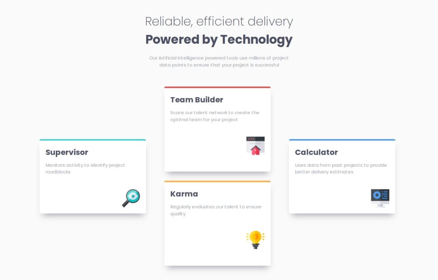
Design comparison
Solution retrospective
I had trouble centering the text after the main title. I was using Flexbox, and when I applied max-width to the text to create the line-break effect without using ``, the text was aligned to the left, as if it wasn’t following Flexbox behavior. Neither text-align nor align-self set to center worked. I used margin-inline-start, but I would like another solution.
Any other tips about something I might be missing would be greatly appreciated!
Community feedback
- @f-avalosPosted 6 months ago
The width of the cards is static, you could adjust it to fit the screen before it drops below 768px resolution, the rest is very good.
0
Please log in to post a comment
Log in with GitHubJoin our Discord community
Join thousands of Frontend Mentor community members taking the challenges, sharing resources, helping each other, and chatting about all things front-end!
Join our Discord
