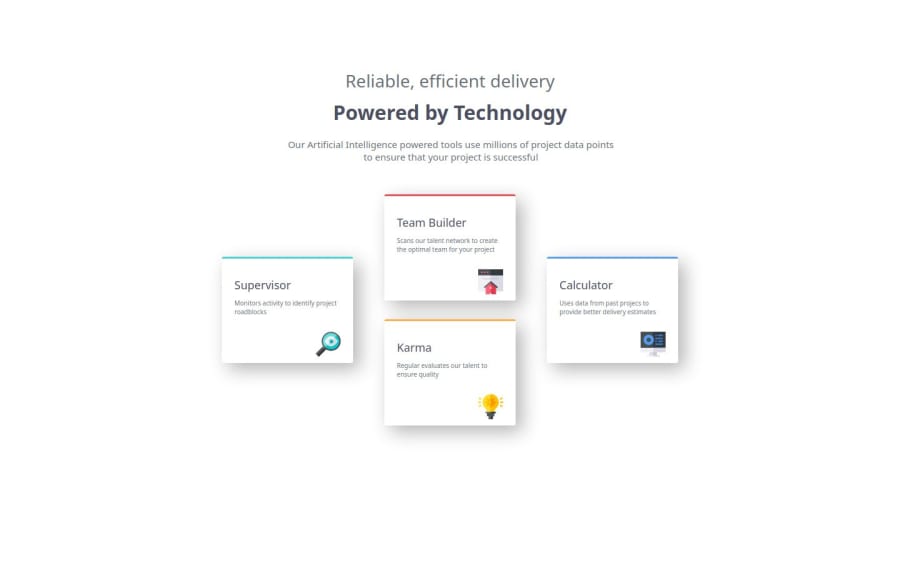
Four card feature section


Design comparison

Solution retrospective
as i always say, i completed this my self
What challenges did you encounter, and how did you overcome them?i encounter plenty challenge but the one that i can remember is that i didnt do the project at once so i am coding and having multiple breaks which make me to be forgetting where i stopped
What specific areas of your project would you like help with?i would like to get help on how i can get finished my project quickly
Please log in to post a comment
Log in with GitHubCommunity feedback
- @ayezabashir
In the design, the first two headings should be of same size and the text below also has more width than the original mockup. You can use "pixel perfect" chrome extension to get those right. Your layout looks a bit scaled down compared to the design, and this tool can help fine-tune that. Besides that, good job.

Join our Discord community
Join thousands of Frontend Mentor community members taking the challenges, sharing resources, helping each other, and chatting about all things front-end!
Join our Discord