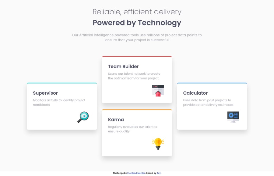
Design comparison
Solution retrospective
I learned to use grid layout effectively in this project. It was harder at first, but it was fun.
I Built this project with, 1. Semantic HTML5 markup 2. Sass custom properties 3. Flexbox 4.CSS Grid 5. Mobile-first approach
I learned, how to move elements without positioning it as absolute. And also learned how to use grid-row/grid-column span.
I would like to thank the developers of Frontend Mentor community, whose codes helped me a lot in learning the proper uses of HTML tags and CSS properties. This project is not an exception to that. I am learning new things every day because of this developing community.
Community feedback
Please log in to post a comment
Log in with GitHubJoin our Discord community
Join thousands of Frontend Mentor community members taking the challenges, sharing resources, helping each other, and chatting about all things front-end!
Join our Discord
