Not Found
Not Found
Not Found
Not Found
Not Found
Not Found
Not Found
Not Found
Not Found
Not Found
Not Found
Not Found
Not Found
Not Found
Not Found
Not Found
Not Found
Not Found
Not Found
Not Found

Submitted

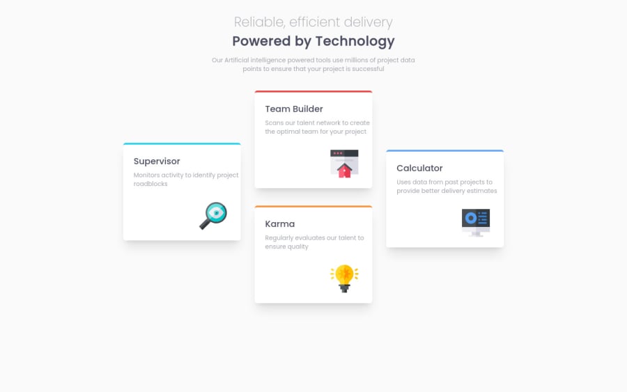
Responsive Four Card Feature Section using Tailwind CSS

@jayantghadge

Desktop design screenshot for the Four card feature section coding challenge

This is a solution for...

  • HTML
  • CSS
1newbie
View challenge

Design comparison


SolutionDesign

Solution retrospective


Should we design Mobile or Desktop first? Tailwind makes the HTML page complicated to read and messy, is there any way to reduce the complexity? Suggestions are welcome. Thank you

Community feedback

@Eileenpk

Posted

Hi Jayant! your project looks great. When I first started using Tailwind I also found it to make the HTML hard to read and look messy. I think it makes it hard to read because when you add class names to target for your CSS you are adding some context to the HTML elements and what you are using them for without having to read what is inside of them. I found that adding a contextual class name at the beginning of the element class name list even if I don't use it for styling helps add readability and helps you see the context of the element in the overall HTML. To make it less messy, I try not to use Tailwind for the typography and style all the type in the CSS. That helps cut down the number of Tailwind classes you add to your HTML. Also if you find yourself using the same bunch of Tailwind classes you can always just make a class in CSS, then add it to all the elements you want to apply it to for example;

  .heading {
    font-family: theme('fontFamily.header');
    color: theme('colors.heading-color');
    font-size: 40px;
    font-weight: 700;
    line-height: 42px;
    letter-spacing: -0.3571428656578064px;
    text-align: left;
  }

  .subheading {
    font-family: theme('fontFamily.header');
    color: theme('colors.heading-color');
    font-size: 32px;
    font-weight: 400;
    line-height: 42px;
    letter-spacing: -0.2857142984867096px;
    text-align: left;
  }

HTML

<h1 class='heading mt-6 mb-6'>this is the heading of the page</h1>
<h2 class='subheading mt-4 mb-4'>this is the subheading of the page</h2>

In this example the tailwind.config file looks like this.

/** @type {import('tailwindcss').Config} */
const defaultTheme = require("tailwindcss/defaultTheme")
module.exports = {
  content: [
    "./pages/**/*.{js,ts,jsx,tsx}",
    "./components/**/*.{js,ts,jsx,tsx}",
  ],
  theme: {
    extend: {
      screens: {
        'xs': "500px",
        'sm': '650px',
        'md': '750px',
      },
    },
    colors: {
      'main-color': '#fafafa',
      'btn-color': '#203a4c',
      'btn-second-color': '#1d3444',
      'heading-color': '#33323d',
      'font-color': '#5b5a63',
      'light-font-color': '96969c',
      'border-color': '#dcdcde',
      'hover-color':'#5FB4A2',
      'form-input-color': '#e6e6e7',
      'error-color': '#F43030'
    },
    fontFamily: {
      text: ['Public Sans', 'sans-serif'],
      header: ['Ibarra Real Nova', 'serif'],
    },
  },
  plugins: [],
}

If you found this helpful please mark it as such :)

Marked as helpful

1

@jayantghadge

Posted

@Eileenpk Thank you for offering your valuable advice.

0
nikoProg 120

@nikoProg

Posted

Good job on completing the challenge!

Most of the time, apps are designed mobile-first. Also, in this challenge's case, it is much simpler to position elements for mobile than big desktop screens.

Marked as helpful

1

@jayantghadge

Posted

@nikoProg It's indeed easy to go for Mobile-first approach. Thanks for the helpful advice!

0

Please log in to post a comment

Log in with GitHub
Discord logo

Join our Discord community

Join thousands of Frontend Mentor community members taking the challenges, sharing resources, helping each other, and chatting about all things front-end!

Join our Discord