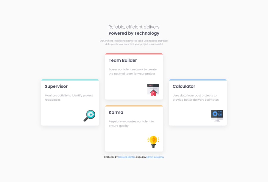
Design comparison
Solution retrospective
Any feedback or suggestion, I will very appreciate.
Community feedback
- Account deleted
Hi, in the header you can avoid use too much margins implementing
text-align: centermake a research, this will improve your code. Also, always put all related elements inside a individual container to be easier to manage.0@oussamaelomriPosted almost 2 years ago@FakeAstronauta I used margins in header because I want to display the header with fixed width, I can't center with text-align alone, text align center the content inside the element, I didn't understand you well. Can you explain more please? and I am very appreciate your feedbacks
0Account deleted@oussamaelomri Sure; if you want a fixed width no matter the size of the screen, you need
max-widthwhich is made for that reason.Text has some special treat, so there are some properties to style it, if you want some special alignment like for example center it related to a container, you need to use
text-align: centerand so on.Marked as helpful1
Please log in to post a comment
Log in with GitHubJoin our Discord community
Join thousands of Frontend Mentor community members taking the challenges, sharing resources, helping each other, and chatting about all things front-end!
Join our Discord
