Submitted 6 months ago
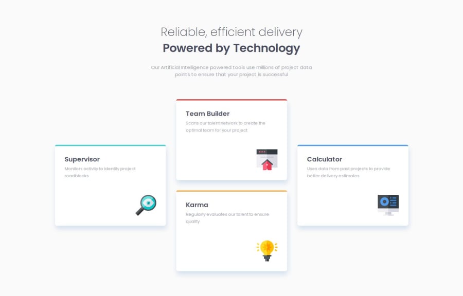
Four Card Feature Section developed using Grid and flex
@tailor-made-god
Design comparison
SolutionDesign
Solution retrospective
What are you most proud of, and what would you do differently next time?
I am most proud of first time using grid and I used it properly. Next time I will try to remove all margins from all elements and try to build the website only using one massive grid.
What challenges did you encounter, and how did you overcome them?I faced a challenge when try to make a text break but I overcome this by using max width property and wrapping the item around div.
What specific areas of your project would you like help with?I find my self using margin property too much to align items, is there any alternate and efficient way of this is usual and normal usage.
Join our Discord community
Join thousands of Frontend Mentor community members taking the challenges, sharing resources, helping each other, and chatting about all things front-end!
Join our Discord
