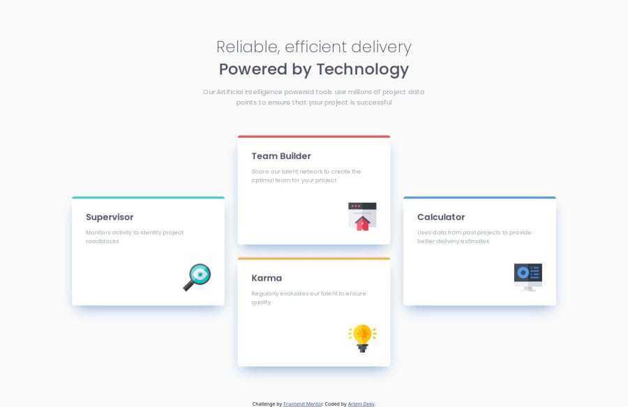
Four Card Feature Section develepoed using html/css, Sass
Design comparison
Solution retrospective
I used both Grid and Flexbox. I personally prefer to use Grid for mackrolayouts (unless the layout is very simple) and flexbox to position elements inside a block.
I used Pixelay again to make it as close to the provided design as possible.
What challenges did you encounter, and how did you overcome them?I added a little animation on hovering over the blocks to make things a little dynamic. This time I went with desktop-first approach for adaptivity (unline my previous project).
What specific areas of your project would you like help with?Again, the text is not exactly as it is in the design.
Also, I couldn't get the box shadows exactly as in the design, although I tried to follow all the instructions provided. So if someone can help me how to correctly do it, I'llvery much appreciate it.
Community feedback
Please log in to post a comment
Log in with GitHubJoin our Discord community
Join thousands of Frontend Mentor community members taking the challenges, sharing resources, helping each other, and chatting about all things front-end!
Join our Discord
