

Design comparison

Community feedback
- P@Kein-InternetPosted 8 months ago
Close to the design, good use of CSS variables, added padding the body so it doesn't touch the sides, use of
reminstead ofpx. Great work! Just one thing:-
A
<h2>tag should never be above a<h1>tag as screen readers and assitive technologies for the visually impaired rely on the logical heading structure for navigating users on your site. Not having proper heading orders will confuse the users that rely on these assitive technologies. I suggest you ammend the heading order and try to style them to the design. -
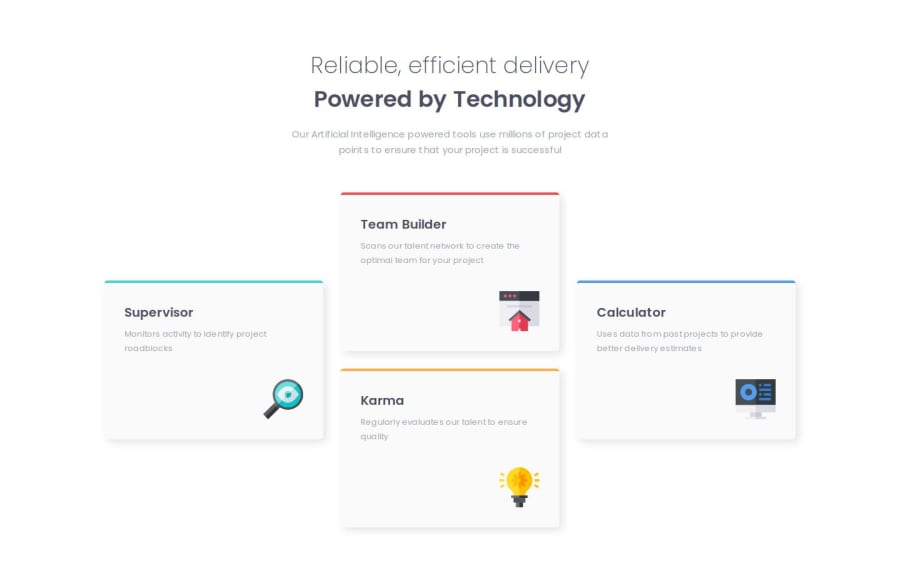
The colors for the cards and the background are also inverted.
Keep it up.
0 -
- @WaelBenseghirPosted 8 months ago
How did you make the design this close? did you use the figma design ?
0


Please log in to post a comment
Log in with GitHubJoin our Discord community
Join thousands of Frontend Mentor community members taking the challenges, sharing resources, helping each other, and chatting about all things front-end!
Join our Discord