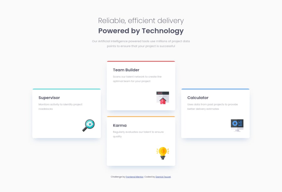
Four card feature section - CSS Open Props & Vite
Design comparison
Solution retrospective
I learned to use CSS Open Props in this project. I think next time I will use Tailwind CSS.
What challenges did you encounter, and how did you overcome them?No real challenges, but I look forward to the next project.
What specific areas of your project would you like help with?I welcome any constructive feedback. 😊
Community feedback
- @vanzasetiaPosted about 3 years ago
Very nice work on this challenge, Darrick! 👋
It's great to see you submit another great solution! 🙌 It's responsive and looks good on both landscape and portrait mobile views! 👍
I don't understand Vite however, I notice that the first section is wrapped with
headertag which it should not. This site doesn't have aheader. Normally,headeris going to have a logo andnavelement. The heading one should live inside themainelement (which commonly the heading for the hero section).Overall, great work and it's great that you added a cool hover effect on those cards. Keep up the good work! 👍
Marked as helpful1P@DarrickFauvelPosted about 3 years ago@vanzasetia Hi Vanza! 👋
Thank you for the kind words. I always appreciate your helpful feedback.
Vite is very good and fast. I'm now using it instead of Parcel and Webpack. It also supports Sass out-of-the-box as they say. Vite website
Regarding the
header, I guess I fell into the page pattern of applying a header, main, and footer. But, as this is a "section" project, I've now wrapped theheaderandcardsinto asectionlandmark. I think it works better as a section > header. Does that make sense? 🤷♂️I just updated this solution and it is now more visually closer to the design and is using more CSS Open Props. Open Props 💖
The hover effects are my way of having a little fun
transforming the design.Thanks again for the great feedback, Vanza! 😊
1@vanzasetiaPosted about 3 years ago@DarrickFauvel I recommend still keeping the
mainand removing theheader.headerinside thesectionelement would have no meaning which means it doesn't make it more accessible and hurt the accessibility at the same time. It works likediv. So, all the child elements of thebodyelement would be landmark elements (mainandfooter).Also, nice work with the update! It's amazing that it perfectly matches the design! 👏
Keep up the great work! 👍
Marked as helpful1P@DarrickFauvelPosted almost 3 years ago@vanzasetia Thanks for making that clarification about main, header, & section.👍 I have made the correction.
Thanks for kind words about perfectly matching the design. I know the goal is not pixel perfection, but I try to get pretty close. Even if it makes me 🤪.
0
Please log in to post a comment
Log in with GitHubJoin our Discord community
Join thousands of Frontend Mentor community members taking the challenges, sharing resources, helping each other, and chatting about all things front-end!
Join our Discord
