Submitted over 1 year agoA solution to the Four card feature section challenge
Four Card Feature Section Challenge Solution
@6xg0d

Solution retrospective
What are you most proud of, and what would you do differently next time?
I'm proud I learned the basics of CSS grid. Still having to practice and get used to it, but i was great to learn something new!
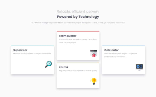
What challenges did you encounter, and how did you overcome them?Positionating the card. I used position to set the position of the side cards, and using grid properties to positionating the card at the bottom.
What specific areas of your project would you like help with?I'd like some help to understand why the "Karma" card gets a smaller than the other ones when it gets below. Also, how to set the svg at the right bottom side of the card in a better way.
Code
Loading...
Please log in to post a comment
Log in with GitHubCommunity feedback
No feedback yet. Be the first to give feedback on 6xg0d's solution.
Join our Discord community
Join thousands of Frontend Mentor community members taking the challenges, sharing resources, helping each other, and chatting about all things front-end!
Join our Discord