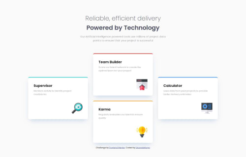
Submitted about 1 year agoA solution to the Four card feature section challenge
Four card feature section challenge leve 1 grid
P
@eduardomumo

Solution retrospective
What specific areas of your project would you like help with?
Any suggestions on how I can improve are welcome!
Cualquier recomendación de como puedo mejorar, se los agradecere
Code
Loading...
Please log in to post a comment
Log in with GitHubCommunity feedback
No feedback yet. Be the first to give feedback on Eduardo Muñoz's solution.
Join our Discord community
Join thousands of Frontend Mentor community members taking the challenges, sharing resources, helping each other, and chatting about all things front-end!
Join our Discord